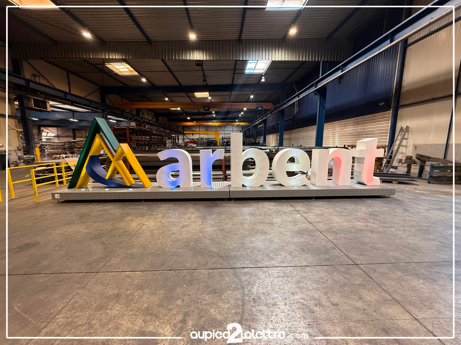
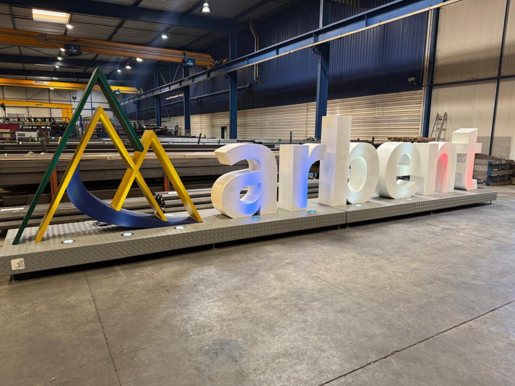
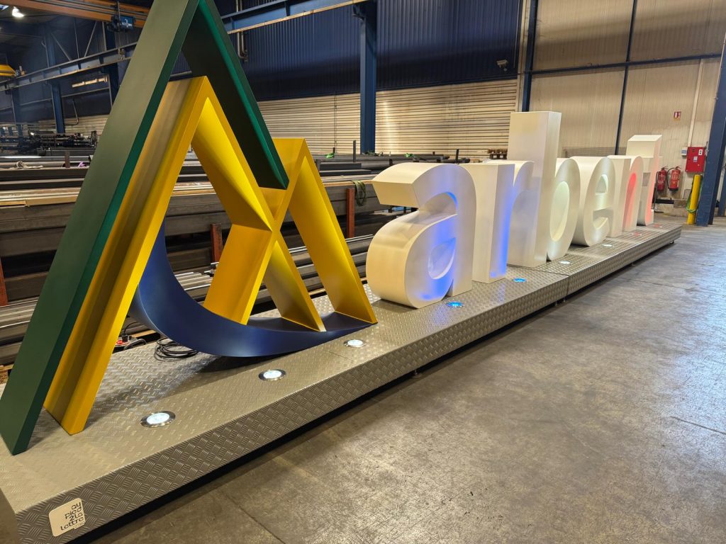
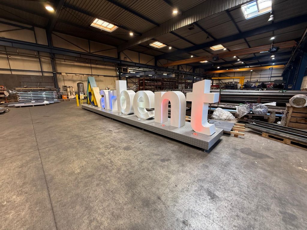
The Arbent giant logo is not simply a word. It is made up of two distinct elements, complementary, and each demanding in its own way.
On one side, the giant icon logo: three interlocking triangles in green, yellow and navy blue, evoking relief, dynamism and depth. On the other, the “arbent” lettering in rounded typography, white lacquered, designed to illuminate.
Two families of forms. Two manufacturing logics. One single whole, mounted on a diamond-plate aluminium base, ready to shine.
In the workshops: where it all begins
The photos speak for themselves. Across several hundred square metres of workshop, overhead cranes, stocked sheets of metal and CNC machines: this is where the giant letters and XXL monumental logos of Au Pied de la Lettre are born.
For Arbent, the manufacturing process mobilised the full chain of expertise:
- Laser cutting of sides and faces, with millimetre precision to respect the sharp angles of the geometric symbol
- Folding and assembly of the triangles — every edge must be clean, with no burr, no approximation
- Rolling of the lettering curves, to achieve perfectly regular rounded forms on each letter
- Continuous welds, invisible once the finish is applied
- Epoxy paint in three distinct shades for the symbol — green, yellow, blue — and white lacquer for the lettering
- LED integration: low-consumption lighting concealed in the base and letters, capable of producing variable chromatic atmospheres, from cool blue to warm red
Light as a second material
What strikes you in the workshop photos is the way the XXL letters illuminate. LED lighting is not an accessory: it is an integral part of the project from the very first design stage.
The “arbent” letters become translucent under the effect of light, changing atmosphere according to the projected colour. In the evening, the effect is striking. At night, the monumental structure continues to exist, to communicate, to draw the eye.
That is what well-designed XXL communication looks like: a structure that never truly switches off.
A base that makes the difference
A detail noticed on every Au Pied de la Lettre project: the base. Here in diamond-plate aluminium, it is low, stable and clean. It houses the recessed LED spots directed towards the logo, guarantees the self-stability of the whole without ground anchoring, and facilitates transport and repositioning of the structure as needed.
A giant letter without a well-designed base is a beautiful piece placed on the floor. With a considered base, it becomes a monumental installation that asserts itself.
Au Pied de la Lettre expertise: far more than a manufacturer
Behind every giant letter or monumental logo — like the giant Arbent logo — that leaves our workshops, there is a method. A method built project after project, client after client, over the years.
Au Pied de la Lettre is not a printer that simply enlarges things. We are first and foremost metalwork manufacturers, mastering steel, aluminium, rolling, welding and finishing from A to Z. It is this technical expertise, rare in France, that allows us to tackle complex forms where others give up.
We are also obsessed with detail. A poorly rolled curve, a visible weld, a colour slightly off brand: these imperfections never reach the client. They are corrected in the workshop, before they are even noticed. This is why our projects always look like what the brand expected. Often, better.
Today, this expertise allows us to work for local authorities and international brands, sporting events and corporate launches alike.
The giant Arbent logo is fully part of this trajectory.
Do you have a project for giant letters, an XXL logo or a luminous monumental structure?