Airbnb: a global brand
Airbnb is one of the most recognised brands on the planet. Its continuous ribbon logo embodies people, places and the feeling of belonging. It is in this spirit that the brand organises the Host Summit every year — its major international gathering of the host community.
Reproducing the giant Airbnb logo therefore carries an immense responsibility. Every curve must be respected. Every proportion, held. No concession on the finish is conceivable.
This is precisely the challenge that Au Pied de la Lettre, French leader in the manufacture of giant letters and monumental logos, chose to take on. And to succeed at.
A technical challenge of the kind we love
This monumental logo resembles no classic letter. It forms a closed sculpture, in a continuous ribbon, with no right angles, no simple flat surfaces.
Furthermore, the site constraints add an additional difficulty. The parquet floor of the barge prevents any ground anchoring. The structure must therefore stand alone, install quickly and travel without damage.
Our teams mobilised the full manufacturing chain:
- CNC laser cutting for perfect curves, to the millimetre
- Bespoke rolling and assembly, with no pre-existing template for this unique form
- Continuous welds, imperceptible after finishing
- Dry assembly to validate every proportion before painting
- Epoxy coating in the brand’s official signature red
Our teams master every step in-house. From raw steel to the monumental structure delivered on site, we subcontract nothing.
Absolute fidelity to the Airbnb brand guidelines
Reproducing a global brand’s logo in 3D volume means accepting total constraint. No creative freedom. No interpretation. A single requirement: to be perfectly faithful to the original.
The Airbnb red is not just any red. It is a precise, referenced shade, immediately recognisable by millions of people. The slightest chromatic drift shows. The slightest tonal deviation betrays the structure. Our teams therefore worked from the brand’s official files to identify the exact reference, then formulate a matching epoxy paint to the nearest thousandth.
Furthermore, the proportions of the Airbnb logo follow strict rules. The width of the ribbon, the diameter of the arcs, the total height of the form — every dimension is defined in the brand guidelines and tolerates no approximation. Before any cutting, our technicians modelled the piece in 3D to validate every measurement. The dry assembly, carried out before painting, then confirmed the conformity of the whole.
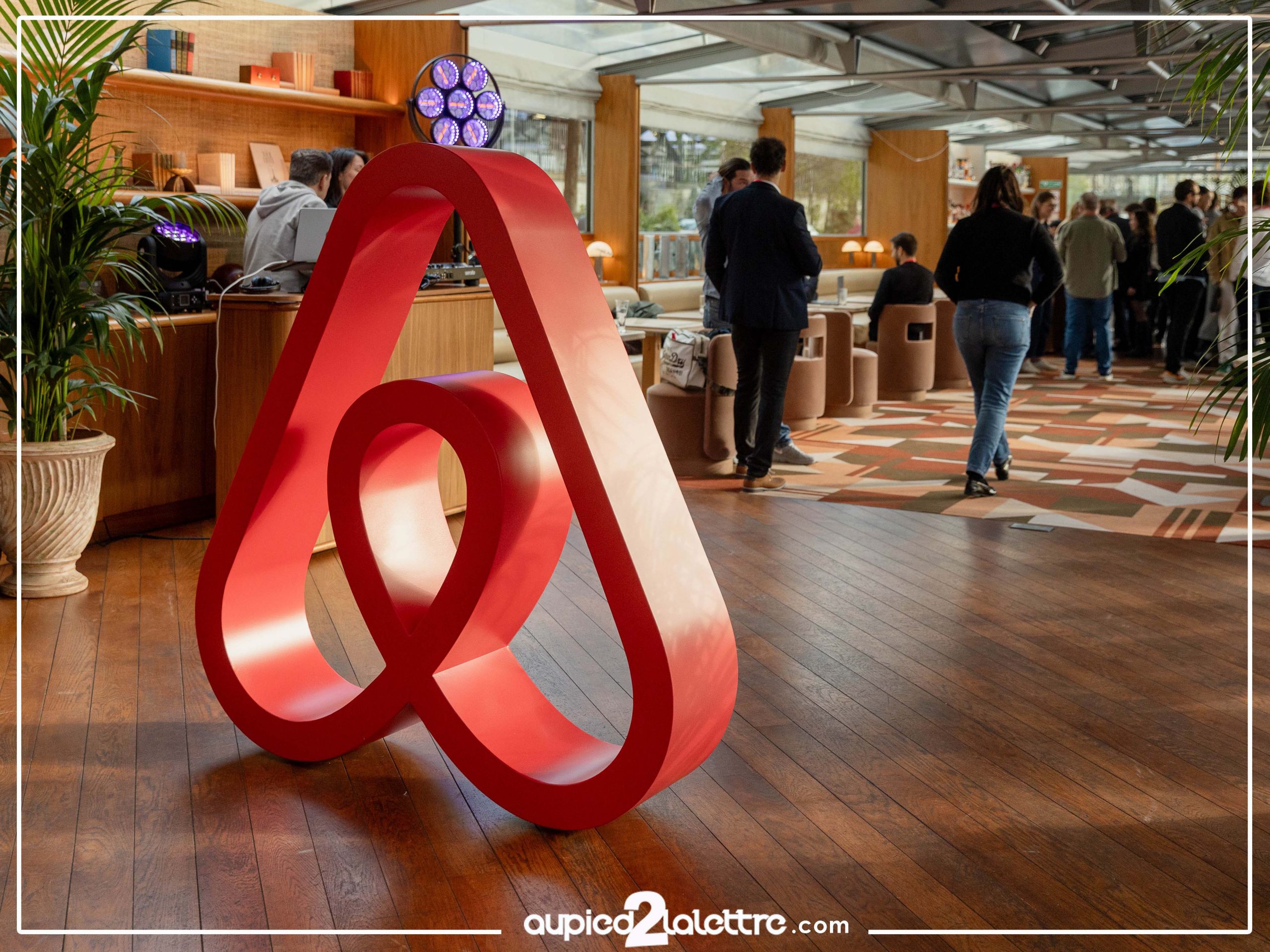
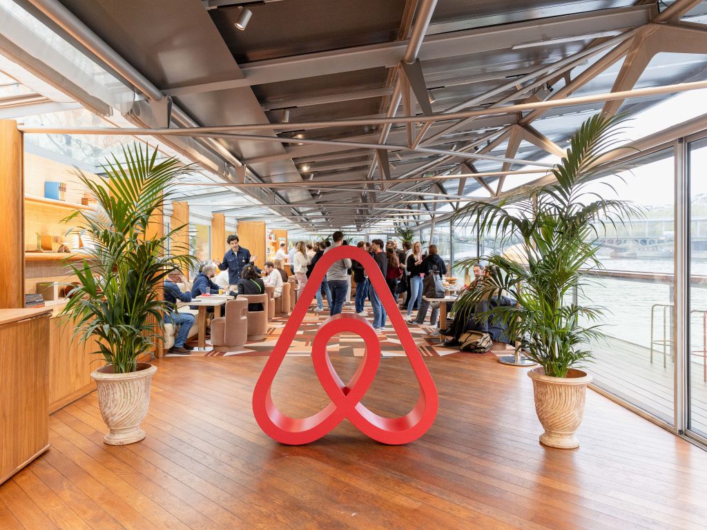
The result speaks for itself. Placed on the parquet floor of the barge, the giant Airbnb logo is immediately recognisable. Not because it is large. Because it is right.
A global brand. An expectation to match
Installed at the centre of the barge, facing the glass panels overlooking the Seine, the Airbnb XXL logo did not simply occupy the space. It defined it.
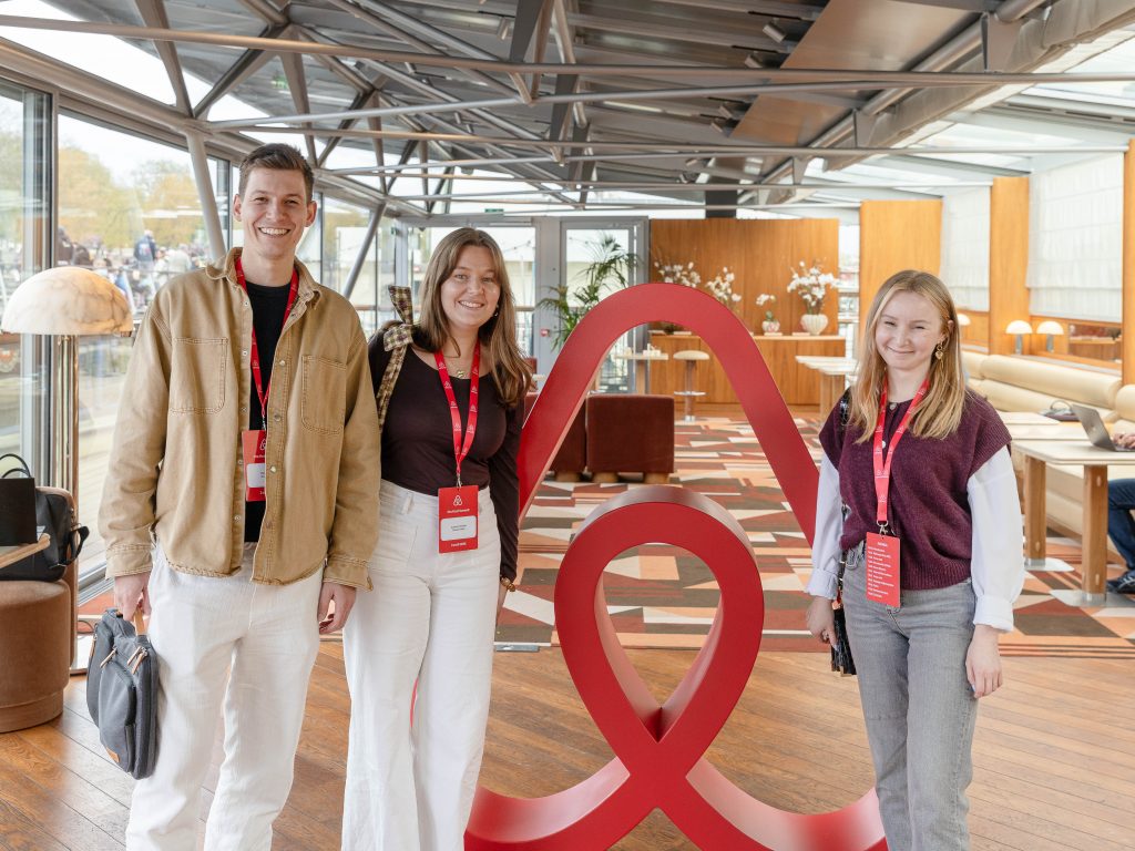
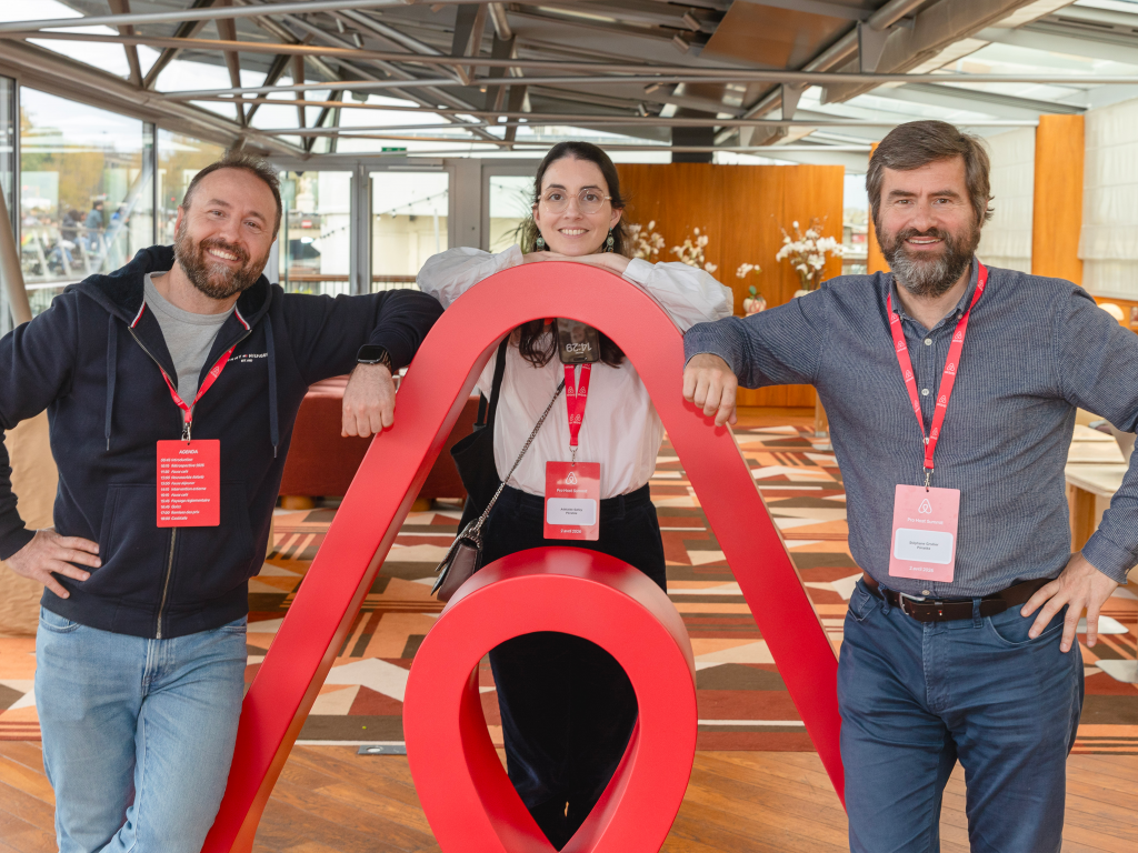
A natural rallying point, a selfie magnet, an immediate visual landmark: within a few hours, the structure had become the beating heart of the event. Every photo shared on social media became, effortlessly, an XXL communication action for the brand.
That is the power of a well-designed giant letter or monumental logo: it does not decorate, it communicates.
When French expertise shines on a grand scale
Au Pied de la Lettre today establishes itself as the undisputed leader in the manufacture of XXL monumental structures in France. From giant letters on the shores of Lake Geneva to bespoke event logos, from major brand signatures to territorial identities — we bring the same standard of excellence everywhere.
This leadership position is not down to chance. It is built on years of rigorous manufacturing, complex projects brought to completion, and a constant obsession: to deliver beyond what the client expected.
The Airbnb logo is today one of the most eloquent demonstrations of that.
Do you have a project for giant letters, an XXL logo or a monumental structure? Local authority, brand, event agency: let’s talk.