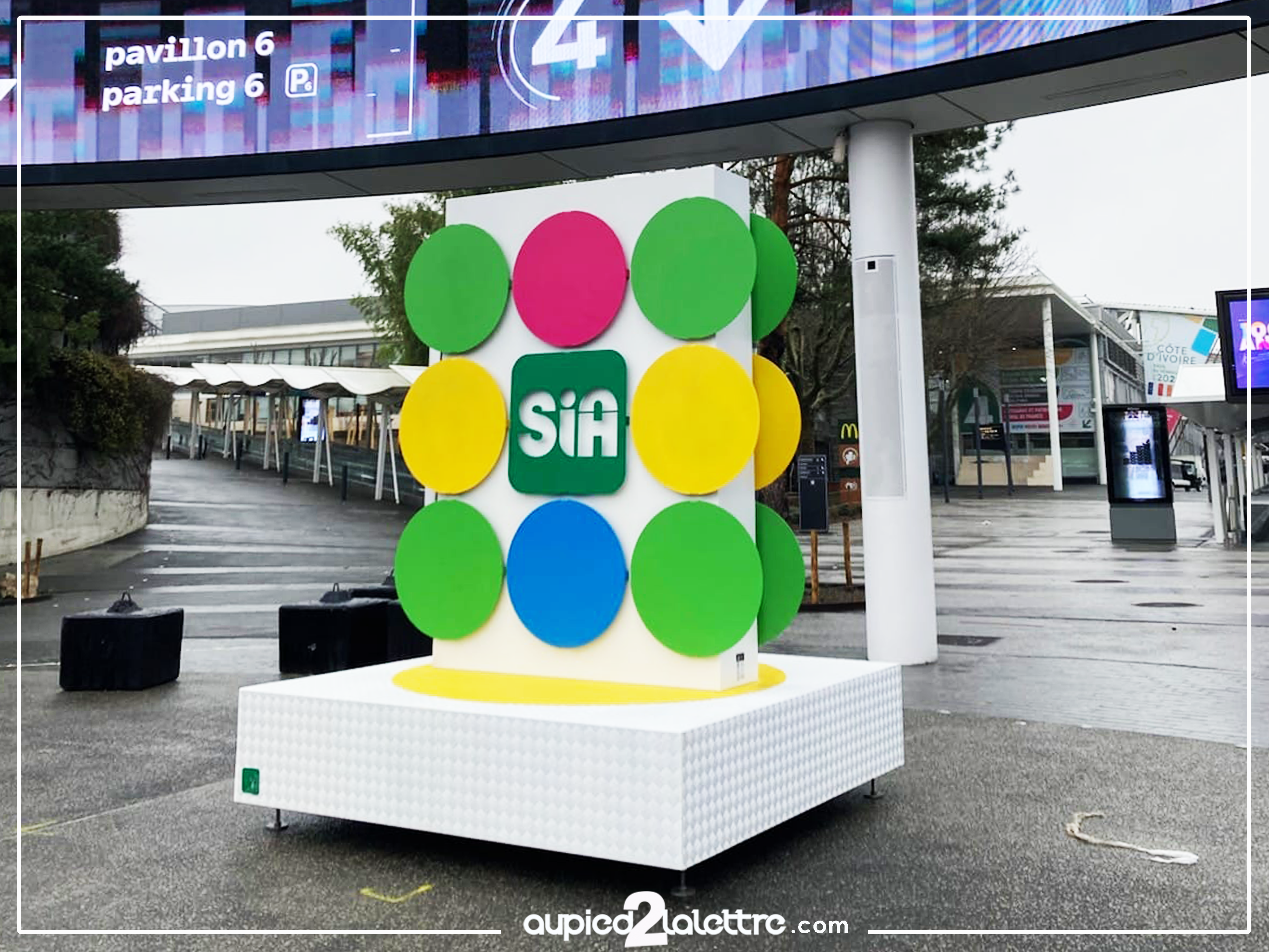
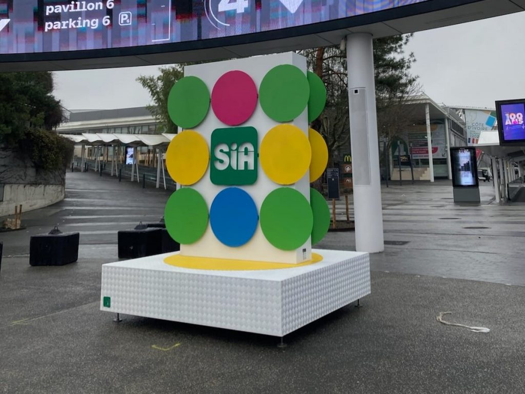
There are events that must be earned. The Salon International de l’Agriculture is one of them. Hundreds of thousands of visitors. Professionals from across Europe. An unmissable agricultural event, the largest on the continent. It is in this exceptional setting that the giant SIA logo was installed, signed Au Pied de la Lettre, French leader in the manufacture of XXL monumental structures.
Reproducing the visual identity of the SIA carries an immense responsibility. Every colour must be respected. Every detail, held. No concession on the finish is conceivable — not here, not in this place.
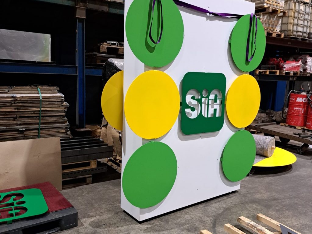
A composition designed to make an impact from the entrance
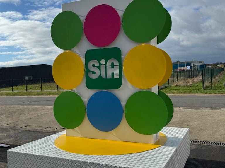
The SIA monumental structure is not simply three letters on a white background. It is a visual universe in its own right. Ten coloured discs — pink, green, yellow, blue — arranged in a grid on a white lacquered panel. A central logo on an intense green background. A white diamond-plate aluminium base highlighted with a bold yellow.
Everything breathes vitality. Everything evokes nature, rurality, the joy of the great agricultural gathering.
Reproducing this identity in 3D volume is a double challenge. Respecting every colour to the exact shade of the official brand guidelines. Giving each disc the right diameter, the right relief, the right depth. At Au Pied de la Lettre, this is exactly the type of constraint we love.
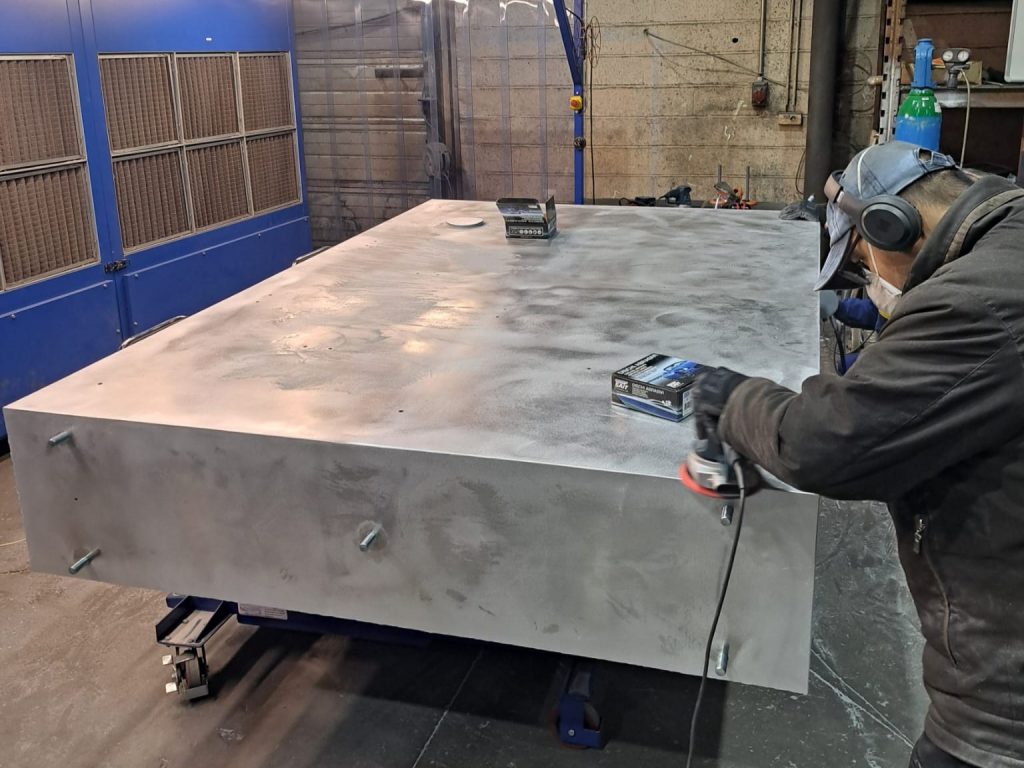
In the workshops: from raw steel to colour
The workshop photos tell the story better than any words. The raw metal base, massive, ground down by a focused technician. The white structure standing, the first discs in place, the handling straps still attached. The workshop alive as it should be — with sheets of metal, pallets, pieces in progress.
This is where every XXL giant logo from Au Pied de la Lettre is born.
For SIA 2026, our teams mobilised the full manufacturing chain: CNC laser cutting for perfect circles to the millimetre, epoxy paint in five distinct shades faithful to the official brand guidelines, assembly on a stable diamond-plate aluminium base with no ground anchoring, and complete finishing in-house. From raw steel to the monumental structure delivered on site, we subcontract nothing.
The discs: when detail becomes signature
It is the detail that makes all the difference. Where others might have simply applied flat colour, we manufactured ten discs in 3D volume, each projecting from the background panel. Each disc has its own thickness. Each curve is perfect.
This work required a fully bespoke manufacturing process. Each circle cut by laser. Each edge rolled with precision. The junction between the discs and the white panel had to be clean, sharp, with no visible gap.
This kind of detail sums up well what we do at Au Pied de la Lettre. Not simply manufacturing giant structures. Understanding a visual identity and translating it into steel, down to the last millimetre.
On site: a presence that defines the space
Installed outside the Parc des Expositions, beneath the large LED ring of Pavillon 4, the giant SIA logo does not seek to blend into the surroundings. It captures them. Within moments, it becomes the natural visual landmark of the event.
Visitors converge towards it. Photos follow one after another. Self-supporting, with no heavy anchoring in the ground, it can be repositioned as needed. Every image shared on social media becomes, effortlessly, an XXL communication action for the brand. That is the power of a well-designed monumental logo: it does not decorate, it embodies.
Au Pied de la Lettre expertise: far more than a manufacturer
Behind every project that leaves our workshops, there is a method. A method built project after project, over the years.
Au Pied de la Lettre is not a printer that simply enlarges things. We are first and foremost metalwork manufacturers, mastering steel, aluminium, rolling, welding and finishing from A to Z. A colour slightly off brand, a visible weld, a misaligned disc: these imperfections never reach the client. They are corrected in the workshop, before they are even noticed.
This expertise allows us today to work for both local authorities and internationally renowned events. The giant SIA 2026 logo is, without doubt, the most colourful demonstration of that.
Do you have a project for giant letters, an XXL logo or a monumental structure? Local authority, brand, event agency: let’s talk.