XXL Letters for towns’ visibility on social media
We have all, during our travels — whether professional or tourist — come across giant letters that we simply cannot resist being photographed in front of. Whether in the world’s greatest capitals or at sporting events and trade shows, this is the communication power of towns that display themselves in giant letters.
Who were the pioneers? How did this enthusiasm for this communication choice come about? What are the manufacturing processes?
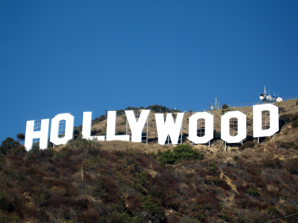
Whether it is the giant Hollywood letters or your company logo placed on stage at the annual flagship event, the objective is the same: to communicate!
It was in 1923 that the Hollywood letters first appeared. The initial objective was to promote a new real estate development. Today they have become the symbol of the city, known the world over. They had to be as large as possible to be seen from as far away as possible — which is why they stand 14 metres high and are located on Mount Lee, overlooking the city.
Today, for towns, it is no longer necessary to be written as large as possible. But one of the most effective ways to gain visibility is to be present on social media.
One of the first cities in Europe to adopt a structure bearing its name was Amsterdam. The success was such that the “I amsterdam” lettering was removed from the Museumplein on 3 December 2018, as its popularity was so great that the city felt too many tourists were gathering in this restricted space. Indeed, every visitor would come to be photographed on these letters and would immediately post evidence of their visit to the capital on social media.
Since then, numerous other towns have surfed this extremely effective trend — from Lyon, Marseille, Montpellier and Le Mans to Sedan, one of the most recent but also one of the smallest towns to date to adopt this communication tool.
At its inauguration in March 2019, the Mayor explained the benefits of this “#sedan” lettering, manufactured by specialist company aupied2lalettre.com:
- A modern, Pop Art structure in painted steel, in a historic town centre
- The possibility of moving this lettering to the most beautiful monuments in the city or to the town’s largest events
- The option to personalise the letters to promote upcoming events or spark the curiosity of locals and tourists alike.
In order to stand out, some communes choose different materials for their projects. It is worth noting that, since everyone’s desire is to climb on these structures, it remains important to combine aesthetics, originality and resistance. Some therefore opt for lettering in wood, plastic or even concrete.
Many towns have projects underway to revitalise their communication. You should soon be seeing these structures installed in Sainte-Maxime, Brest, Rouen, Dax, Troyes… to name but a few!
In addition to travelling the world via Facebook, Twitter, Instagram… the names of towns become a brand adopted by all, extending across a variety of promotional supports.